 we are

 Over the last 2 years I have become more of a supporter of layout then design. Yes, layout is an element of design, but in the web design process they have their own areas and purposes. This post takes a peak at the use of wireframes to help determine a websites layout and also the factors we consider in a web design layout. It’s a great step for the web designer, production team and the client.
Web Design Layout
Simply put, layout is where things go. When I start looking at layout needs and options I consider the following in this order:
1. The user. What do they need to see, read and do. Usability is a big factor in good layout for me.
2. The target market as a whole. There are certain expectations a user might have of a small business website compared to a social media website. These differences determine the navigation, placement and number of “areas” or aspects in the layout.
3. The website owner/company. In building CMS integrated websites for 8 years, we consider the types of information, the amount of information and the placement of that information. The areas of the layout will offer up some static areas of content or functions and others will be dynamic or manageable with the CMS. You must give your client the right tools to offer up their message, communication or features.
Wireframes: The blueprint of the layout
Instead of just jumping to a full blown web design, taking the time to create a wireframe to plan the sites layout, usability and features is a great starting point to your visual design process. It also allows you to worth with your client on these aspects and start understanding the users possible experience. Q & A about CMS features, user needs and structure all can be determined with a wireframe.
In writing this post and doing a bit of research I also ran across these helpful posts on wireframes:
The wireframe serves as a great plan, where the design elements are the polish and can include colors, graphics, gradients, photos, buttons, icons and more. As a designer, it also provides a great in between step for getting your design approved and embraced. You have outlined and provide some foundation to the client, so the first design concept is less of a surprise and of a continuation and enhancement of the wireframe.
A Wireframe Example
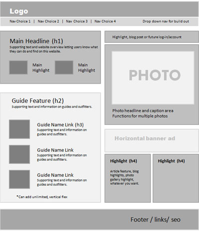
Here is a project we are starting work on and shows our wireframe concept and then the first design mock version of the website. Many web designers will just start adding their design elements right over the exact grid and wireframe once that has been approved. Some prefer to start on paper sketching as well. There is no right or wrong way.

As you can see we also provided some notation on the areas. This is up to you to provide this detail or just keep it to content blocks and usability features.
Next is the web design concept. Keep in mind that this is a rough version one, the finished product will take on more polish and elements. But it serves the purpose for a visual example.

I hope this helps you understand the web design process a bit better and the value of wireframes in the layout and design steps. Feel free to either comment as a client or web designer on how a wireframe has helped your process or maybe you realize it’s time to start using one.